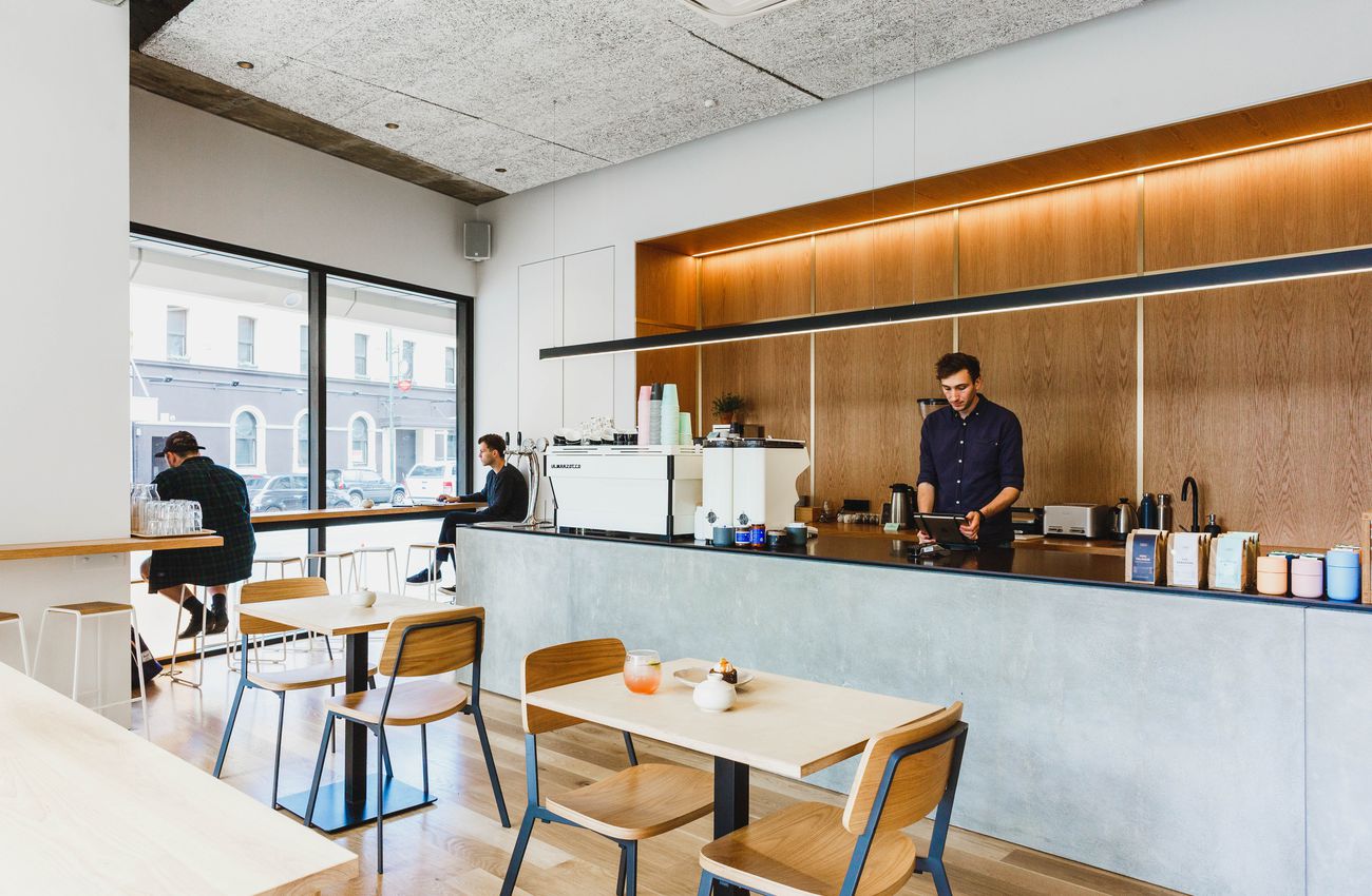
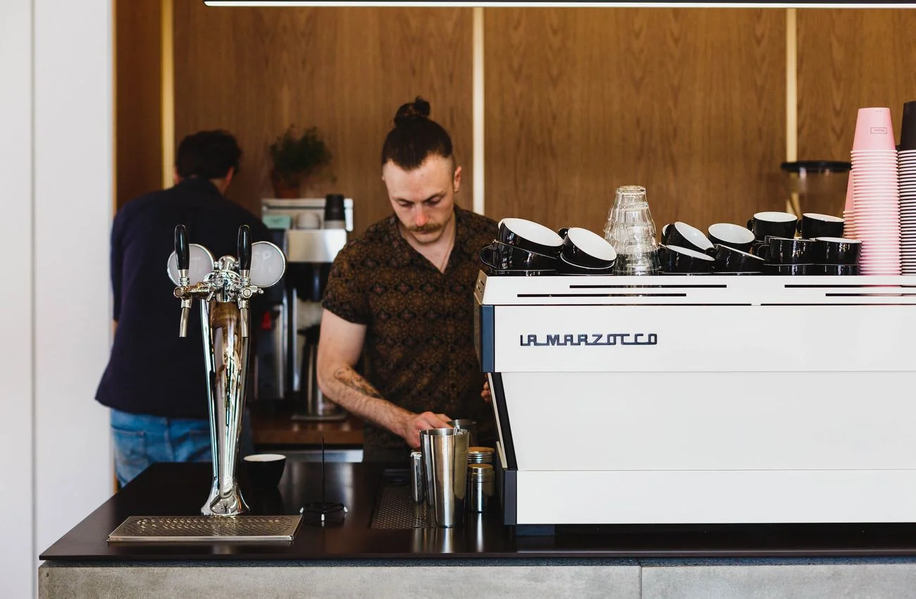
Lukes lane is the Peoples flagship cafe in Wellington, New Zealand.
I liaised with the Peoples team to create a dynamic lighting plan that highlights the minimal architectural detailing, specifying the final light fittings used. Throughout the process I was involved in choosing the final finishes, specifying everything from furniture to the handmade crockery.
Approached by La Cloche, a French-Kiwi fusion cafe established in 2008 with multiple locations around Wellington. I was asked to propose new branding for an overarching La Cloche ‘brand’. Each cafe was then to have specific branding to reflect its own location.
The proposal looked to refresh the La Cloche brand and give a distinction between the company as a whole, and each specific cafe site.
The overarching branding took the imagery of a french bell, as La Cloche means ‘the bell’. I felt it was important to give the company as a whole the identity of the bell, not just one particular site.
Each specific cafe site was then given its own branding, the Central location was given the clock, the Terrace location the cityscape, and the original Kaiwharawhara site a hillscape.
At ECC I provided corporate, private and retail clients with high-end lighting and furniture solutions.
I worked closely with my clients crafting bespoke lighting plans and curating spaces that offer both beauty and functionality. The role saw me build strong relationships working with the very best products and design experts New Zealand had to offer.
I was responsible for curating the Wellington showroom and ordering product based on current and local design trends.
These are a collection of projects from ECC that I was either involved with directly or mirror private client projects that I cannot reproduce here for privacy and integrity purposes.
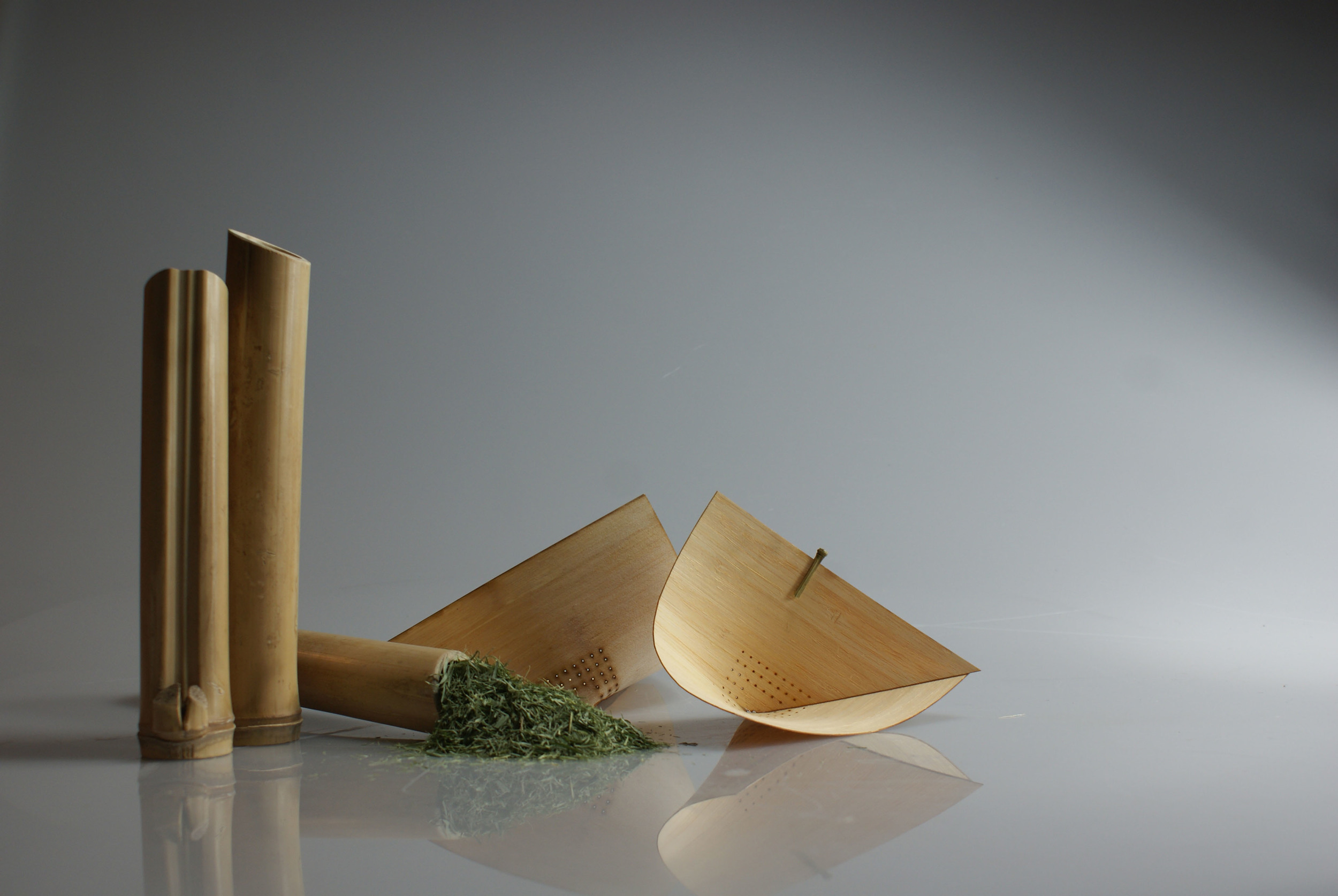
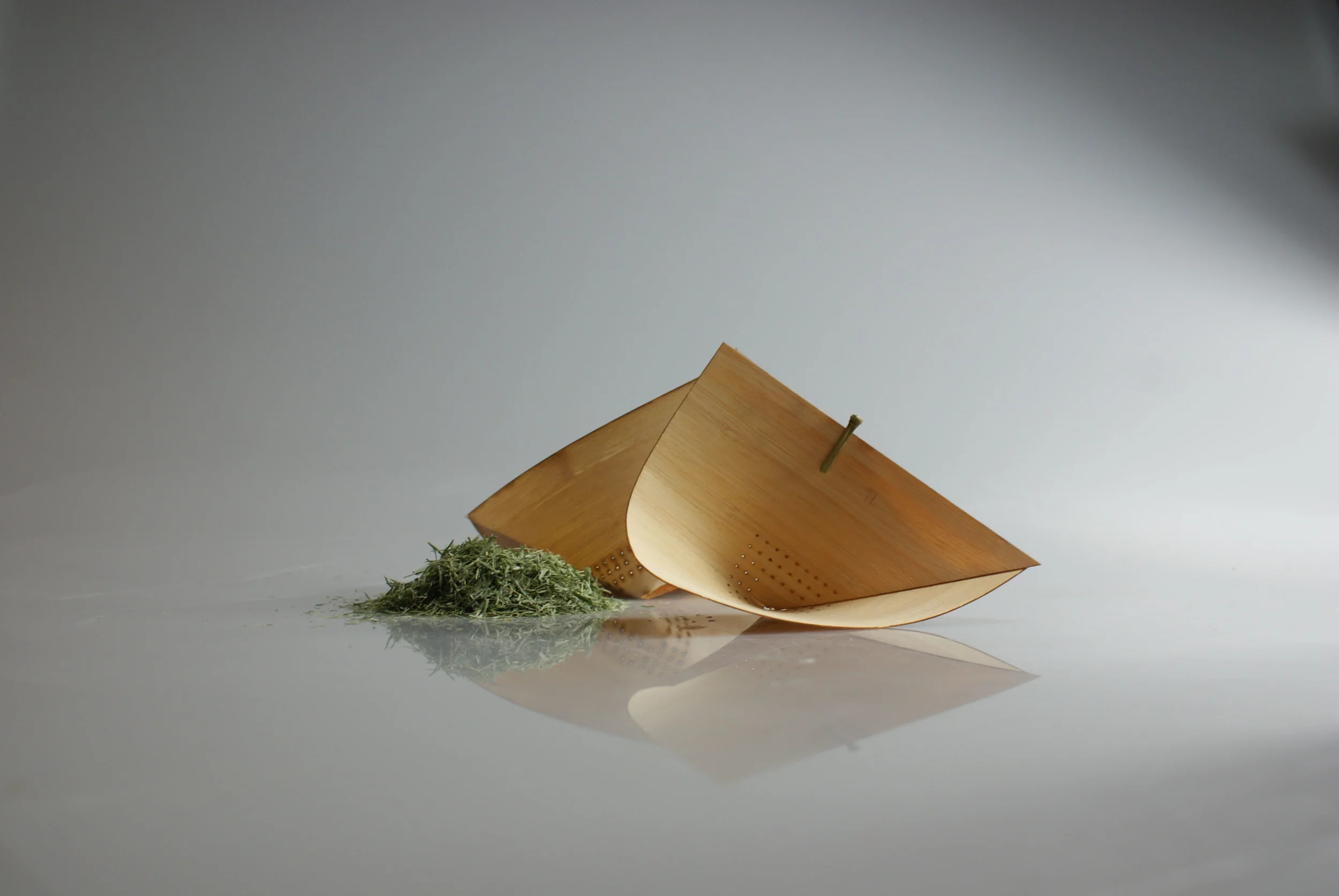
The Bamboo Tea Set was the Overall Winner in the National Student Craft Design Awards hosted by the The Dowse Art Museum in New Zealand.
The Tea Set consists of a shredded bamboo leaf tea, a bamboo strainer with peg, and bamboo drinking vessels.
The projects aim was to discover the many properties that one material can possess.
Judge Emma Budgen commented: “Utilizing bamboo through all aspects of its production, this work beautifully and thoughtfully explores the notion of ‘truth to materials."
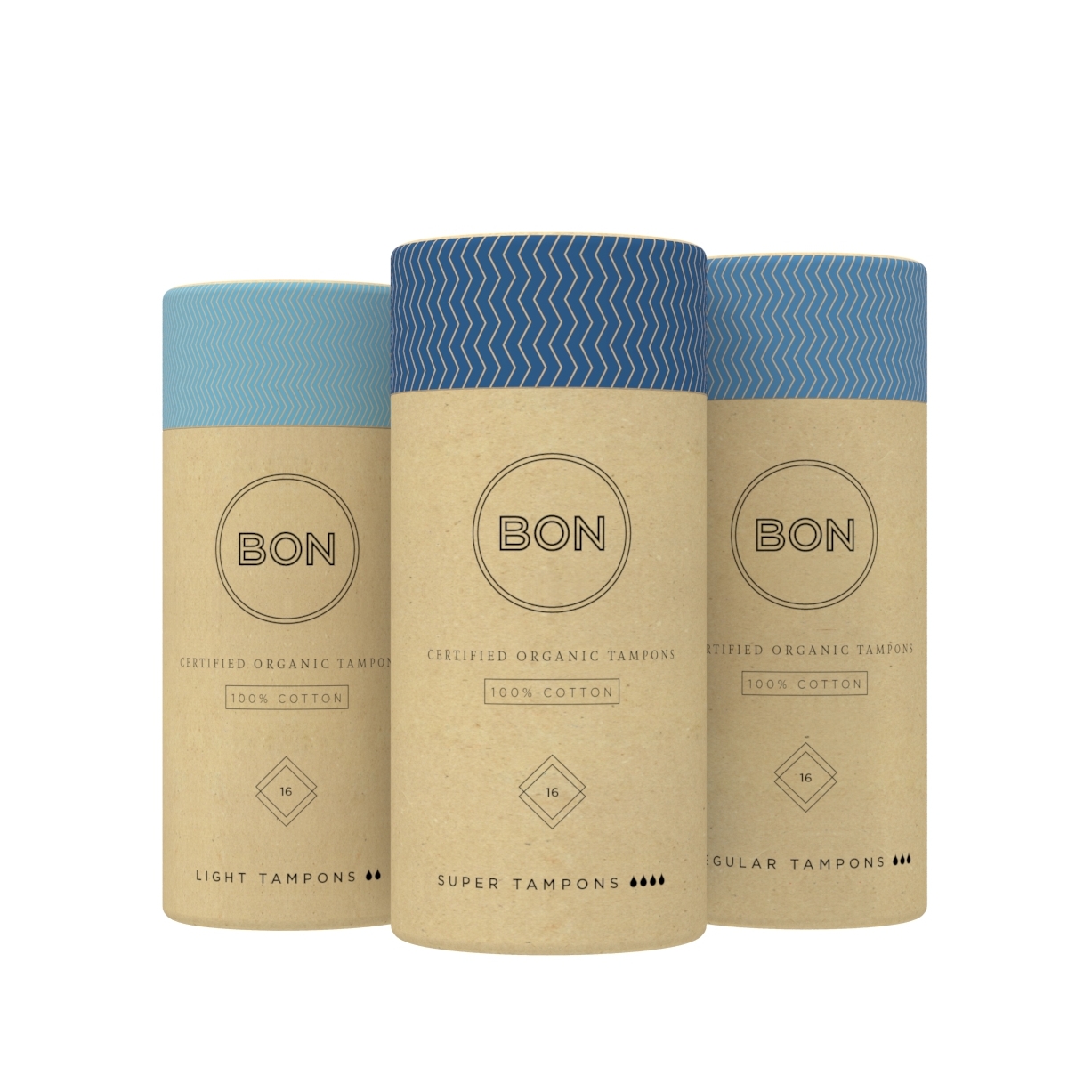
Bon is a premium 100% Organic Tampon range from New Zealand. As Lead Designer I was tasked with a redesign of the current tampon packaging, as well as designing a new range of packaging for a line of pads and liners soon to join the Bon collection.
The introduction of colour was a key component of the redesign. Three blue tones were chosen to work harmoniously with the natural card packaging. The three tones of blue were then carried across both the tampon and the pad and liner range to help reference the products absorbency at a glance.
The graphic design of the packaging was completely overhauled, the overall look de-cluttered and the packaging range streamlined across the existing tampon range and the pad and liner range.
The original zigzag lid of the tampon range was reinterpreted and now the zigzags stroke helps to reference absorbency along with the new colour. The lids for the pad and liner range have been given a stripe graphic which links the new range in with the current tampon range, whist giving it its own identity.
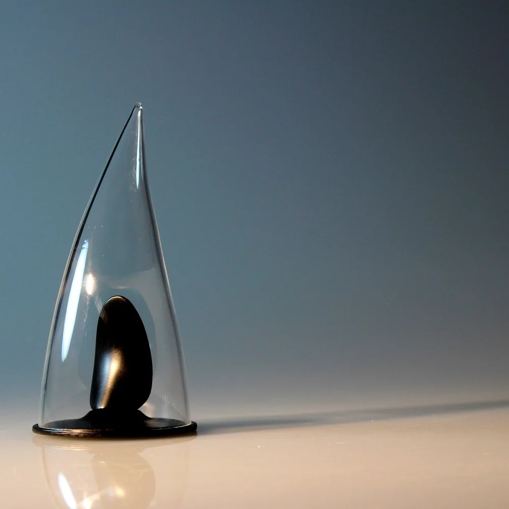
This Project looks at removing user felt shame associated with the ownership of sex toys.
The act of masturbation is a highly sensitive topic in human sexuality, with strong links to taboo and stigma. The act of masturbation is currently shrouded in feelings of guilt and embarrassment for some, even though the act of masturbation is known to be both widespread and a common pleasurable human experience.
Through the opportunity of openly displaying ambiguously designed sex toys I hoped to remove the shame felt by the user, making the user feel openly confident with their sex toy usage.
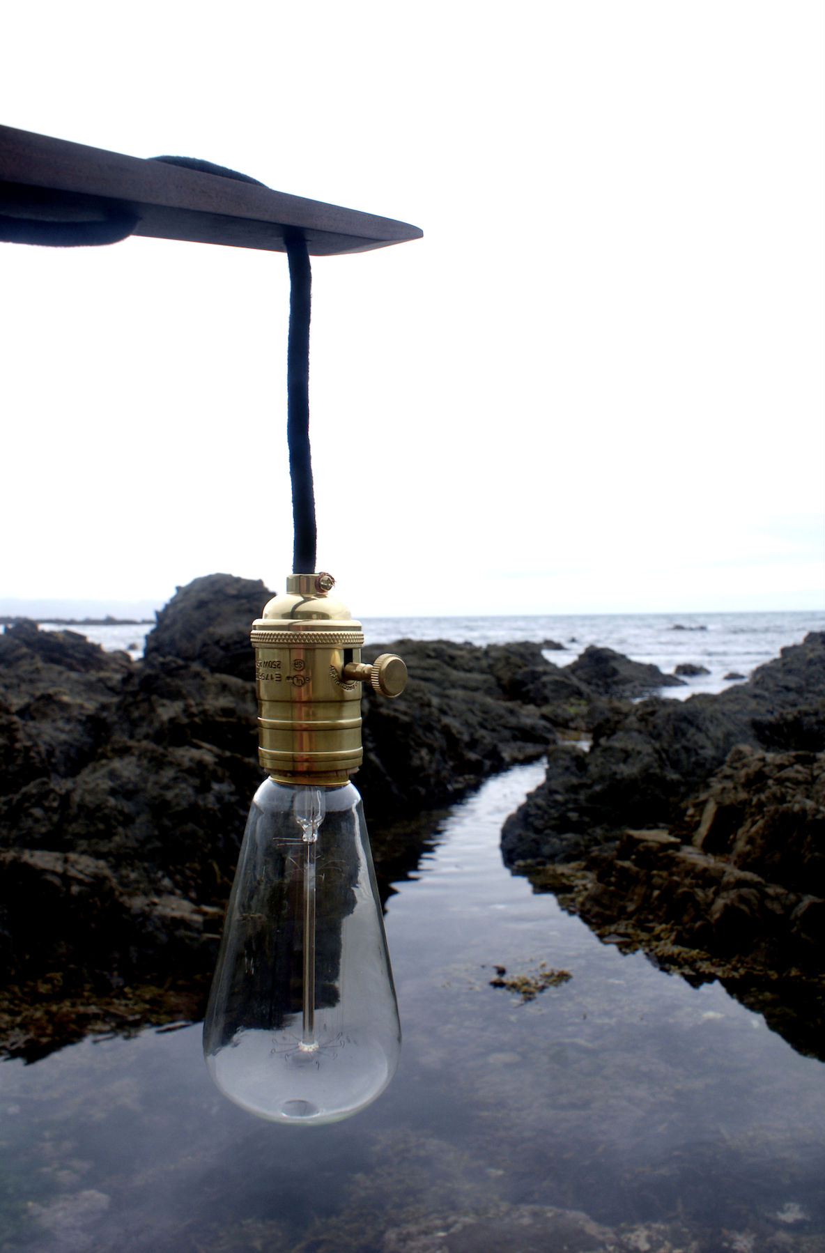
5° is a floor lamp intended to sit behind a chair to provide light.
It is inspired by cranes and the surreal images they throw in a modern cityscape.
The lamp relies on gravity and careful counterweighting and angles to remain positioned.
5° is an award-winning piece, chosen by the Wellington Regional Council for a 1 year design showcase in New Zealand’s capital.
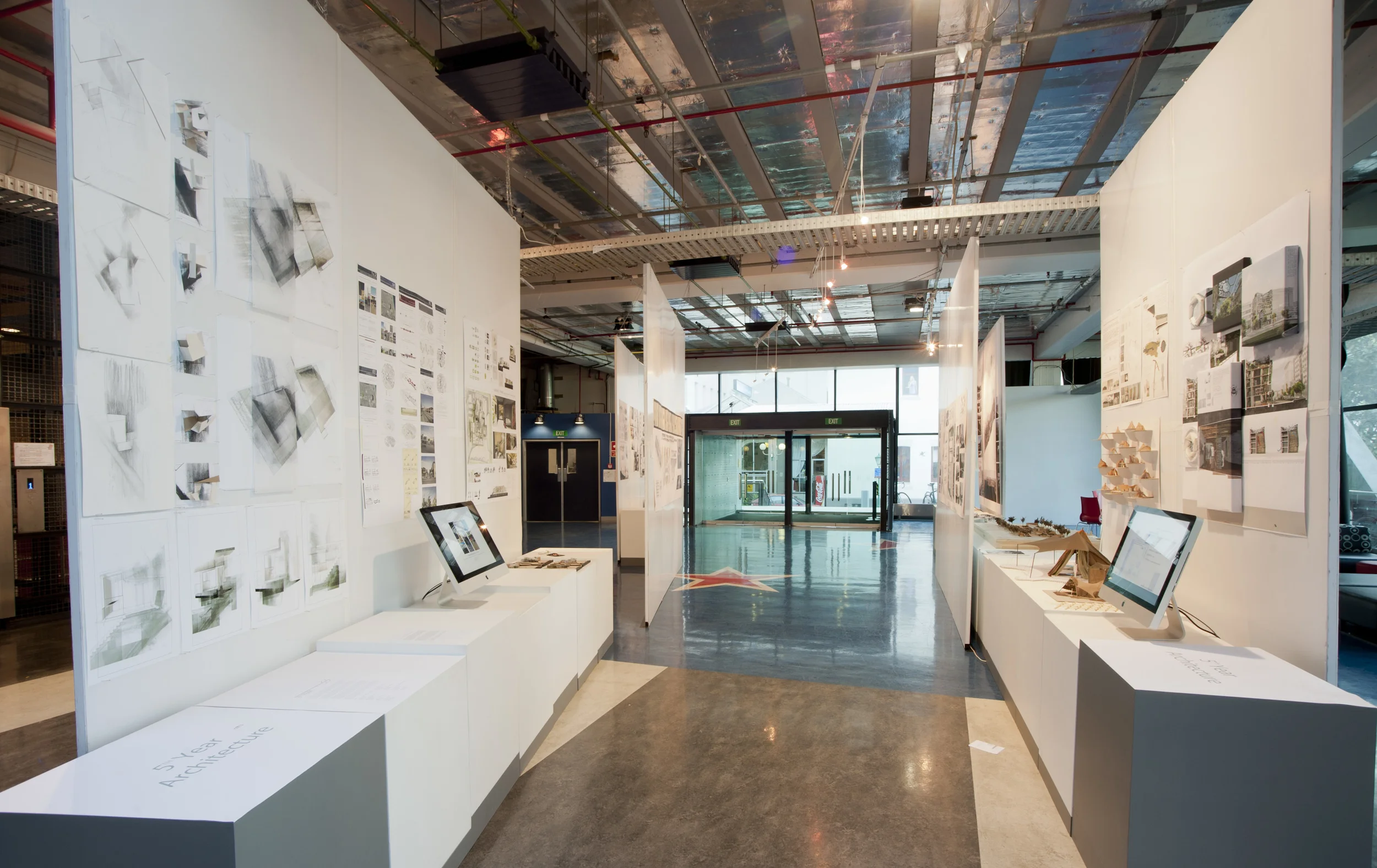
The National Visiting Panel (NVP) Exhibition is an integural part of the Australian and New Zealand Architecture Program Accreditation Procedure (ANZ APAP). Working with Victoria University I was charged with designing and curating the NVP exhibition that would showcase the Architecture schools various programs.
The Exhibition provides a glimpse into the growth of students over the course of 5 years. Beginning with year one, exploring idea generation and creativity, through to full technical drawings and photo realistic renders in the fifth year.
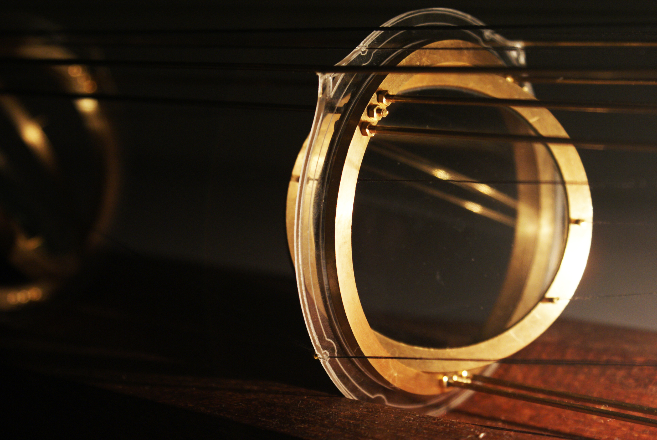
'Blurred' is a physical representation of a degrading eye condition called Glaucoma.
A beam of light passes through a series of lenses positioned in bronze gyroscopes onto a screen where the fine pinpoint of light comes to rest. As threads attached to the gyroscopes are put under pressure the gyroscopes begin to move, distorting the beam of light creating complex blurring shapes on the screen.
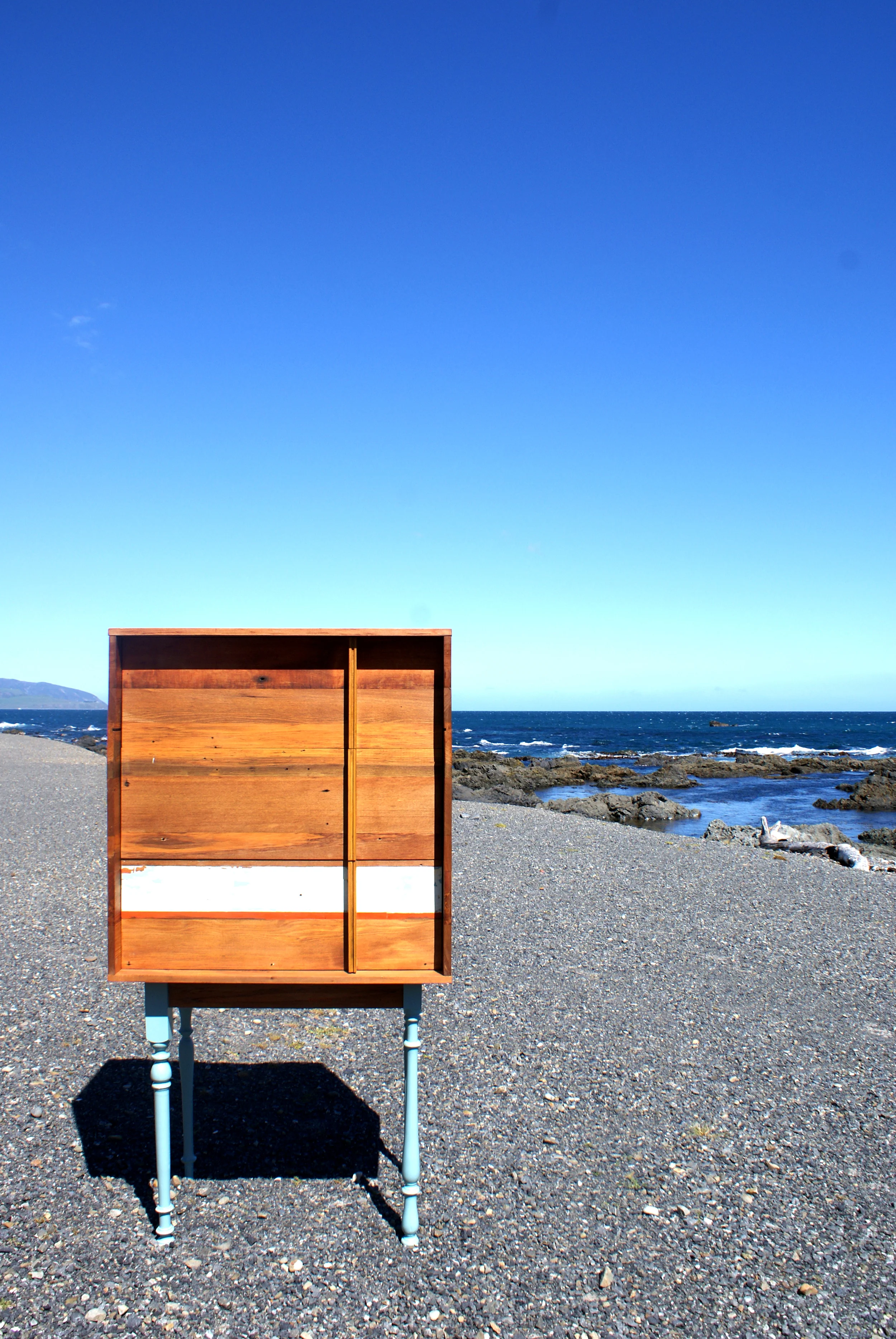
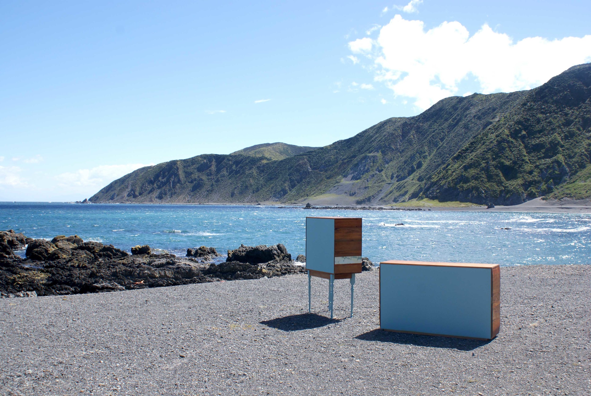
Teal is the embodiment of up-cycling. Teal has been designed with three drawers on the front, and with two compartments for jewellery and perfume bottles, one on either side, which are accessed by sliding out the side panel.
Made out of recycled native and locally found timbers, my design aesthetic is all about an honesty of materials, where the 'imperfections' are kept to reference the materials history.
Conceptual 3D multi sensory ‘billboards’ designed to intrigue the viewer.
I worked in collaboration with MASS Design to create these concepts to help promote the Pleasure Dome - a fully immersive musical experience set in 1980’s New York.
The Purple billboard would ‘sweat’, with the beads of water tracing down the curves to the body.
The Red lips would bubbles which when popped would release the smokey perfumed vapour contained within
As I expanded upon the original Teal cabinet I was heavily influenced with proportion.
Introducing steal into my material palette let me explore visual weightlessness and fragility through my designs.
The Teal collection is ever expanding and evolving whilst still staying true to the original concept of Teal
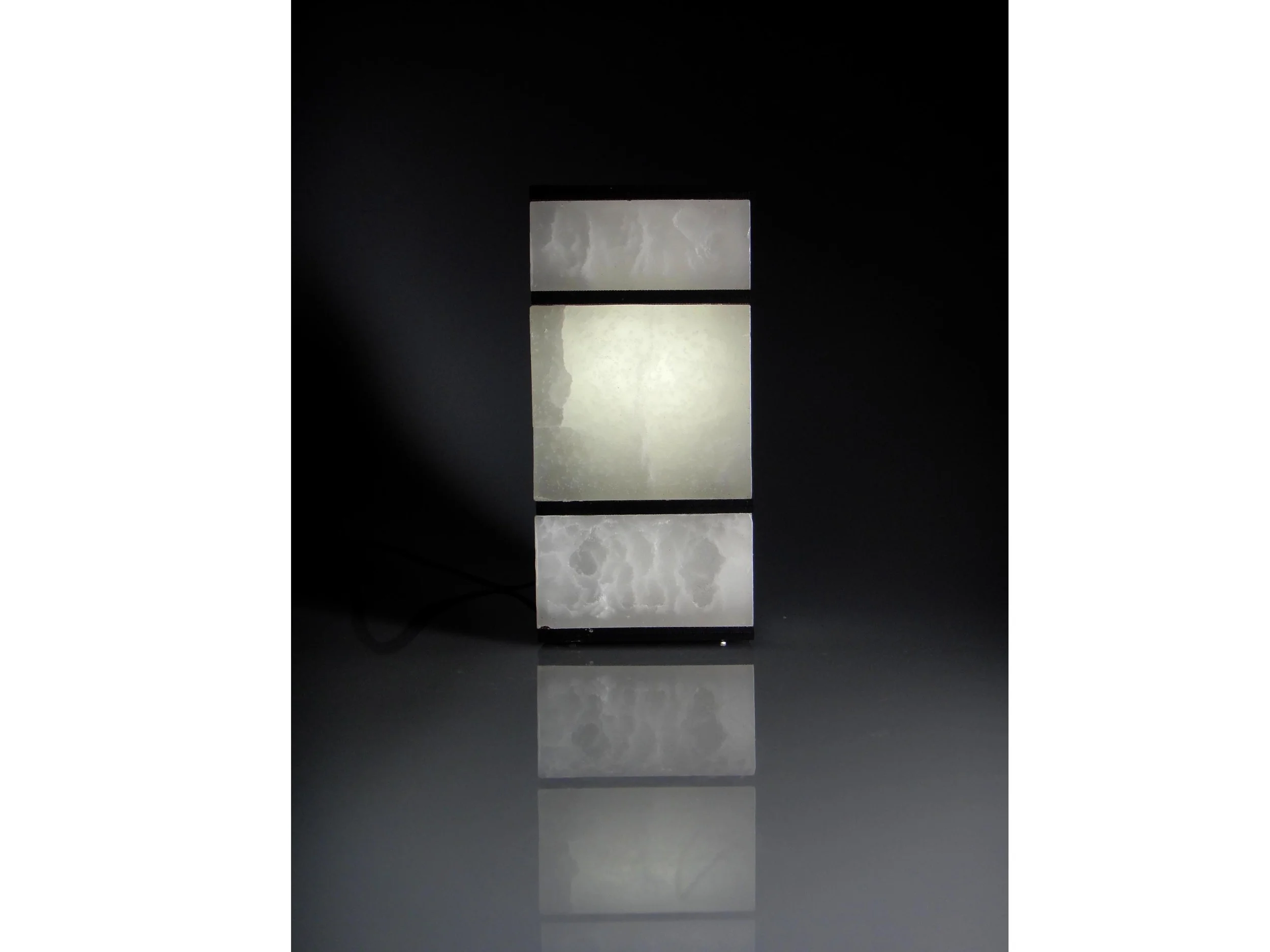
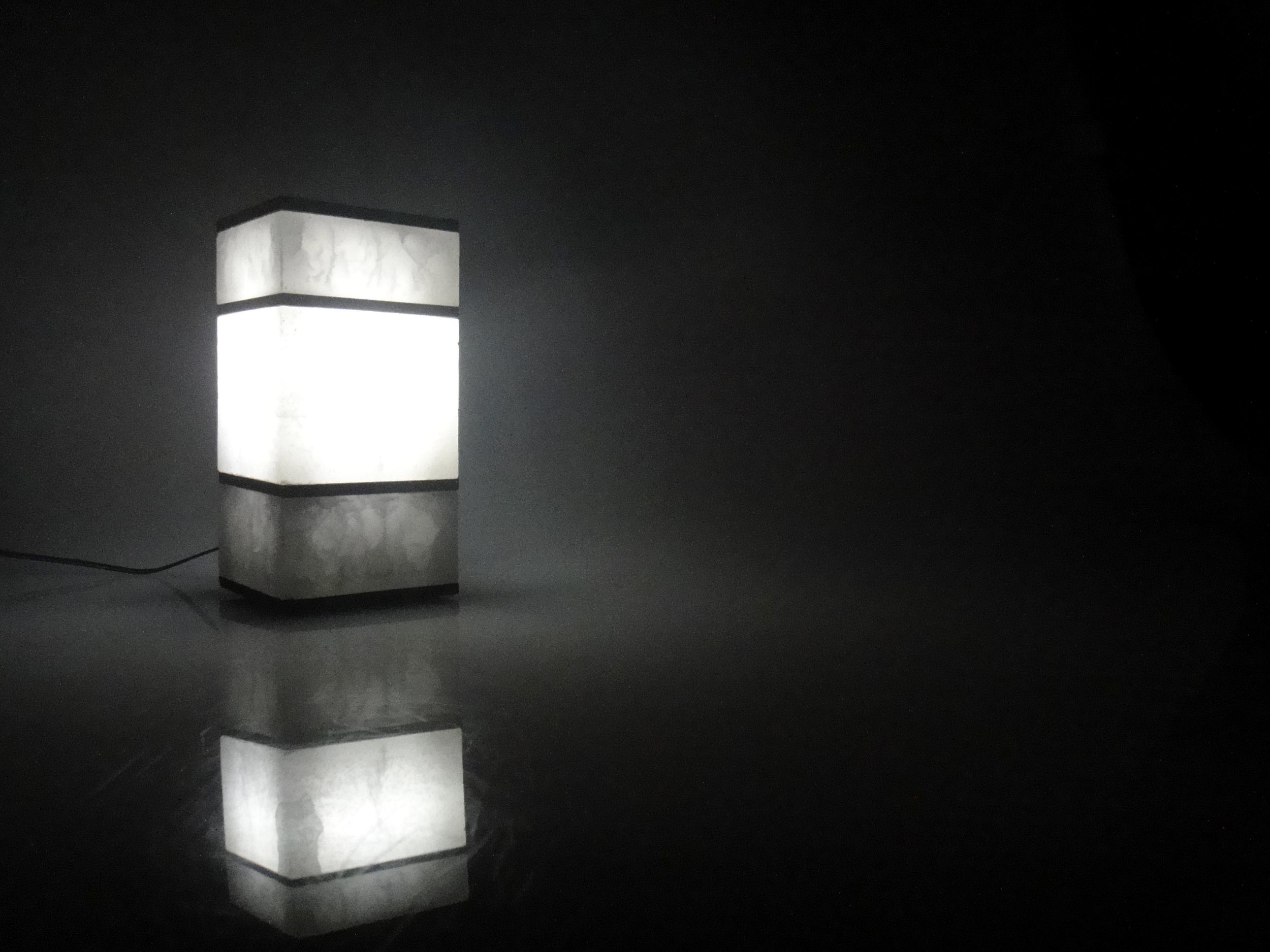
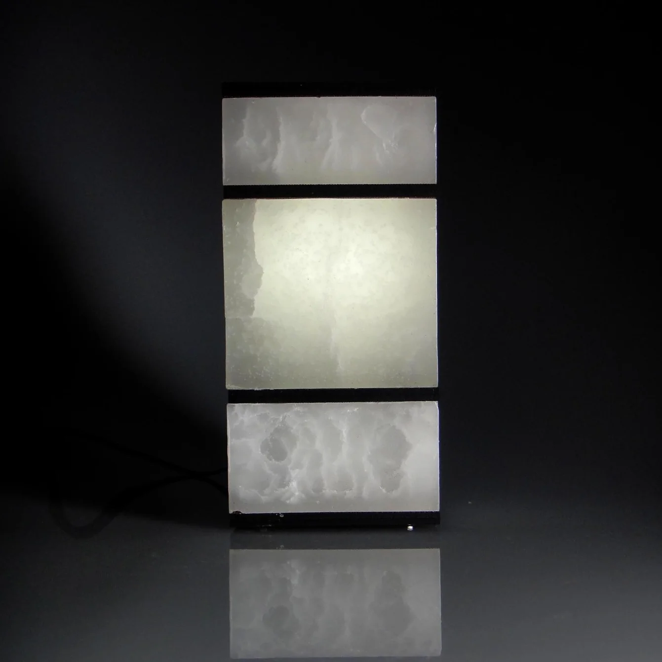
'Paraffin' is the result of a material exploration into the visual effects that can be created with Paraffin wax and light.
Whilst exploring different techniques I was able to 'marble' the wax as it moved from a liquid state into a solid state, while only controlling the temperature and vibration.
'Paraffin' is lit from within to emphasise the ‘veins’ created in the wax. The final proportions are derived from the pieces that form a traditional marble lamp stem.
Opal House are an award winning indie-pop band from New Zealand.
I worked on most of their digital imagery including logos, artwork development for their two albums as well as branding collateral including posters, flyers, a website and other small projects.
For their first album ‘Brontide’ I painted original artwork which I then digitally manipulated to create reflections - a word that the band members had used in their brief.
For the second album ‘Retroflection’ I worked with existing photography provided to me by the band. I also created alternate covers to support the main, graphic pink & black hero image.
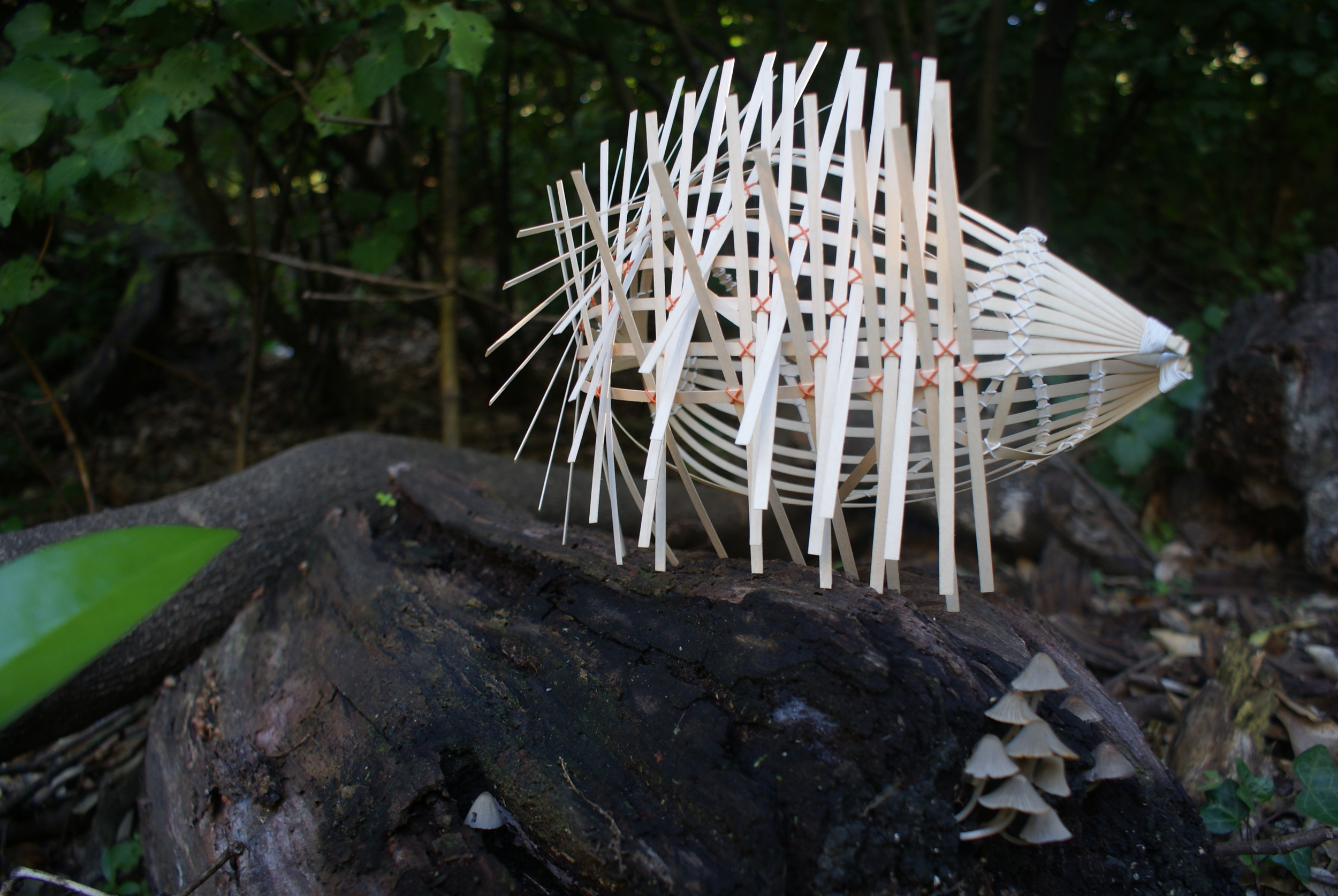
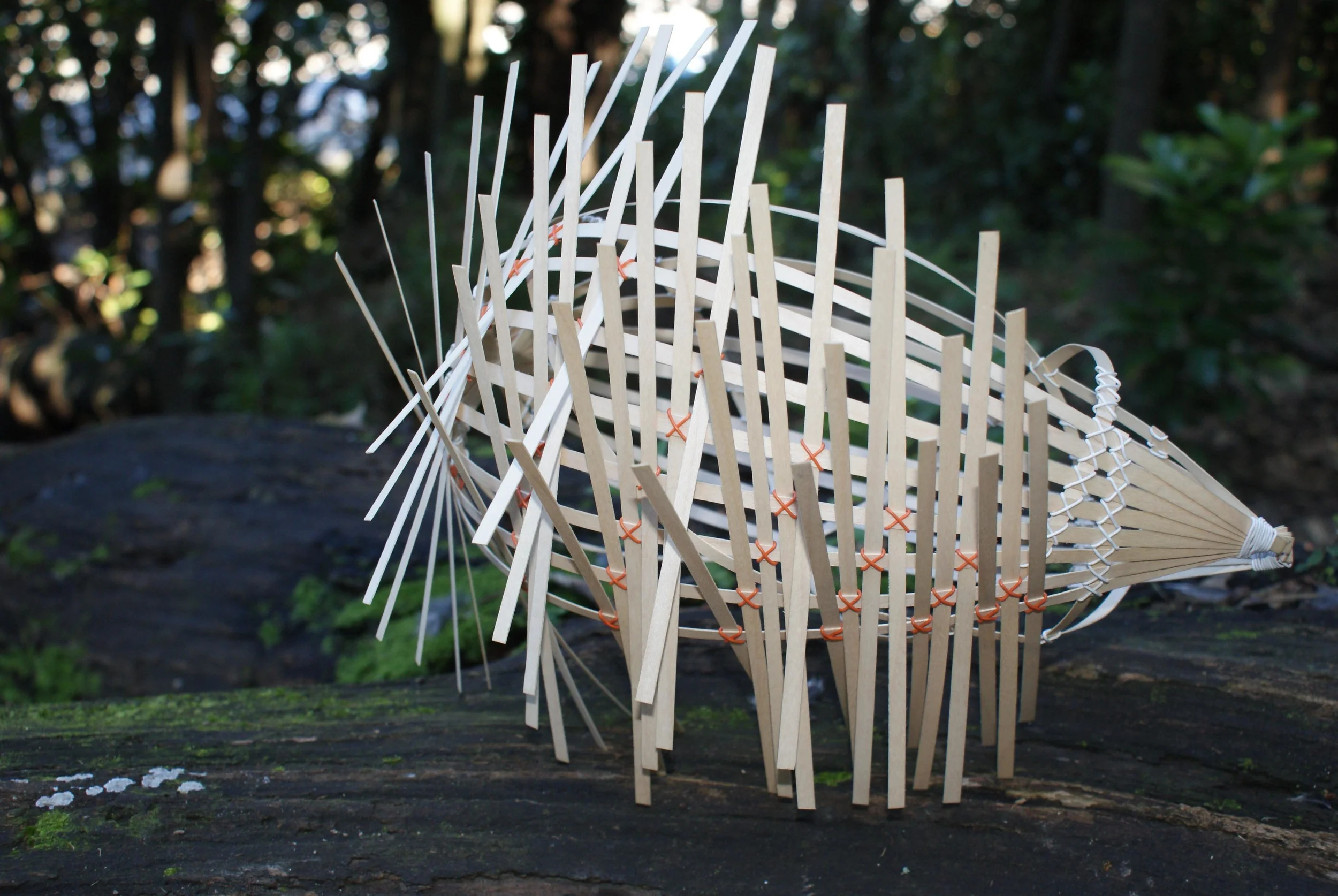
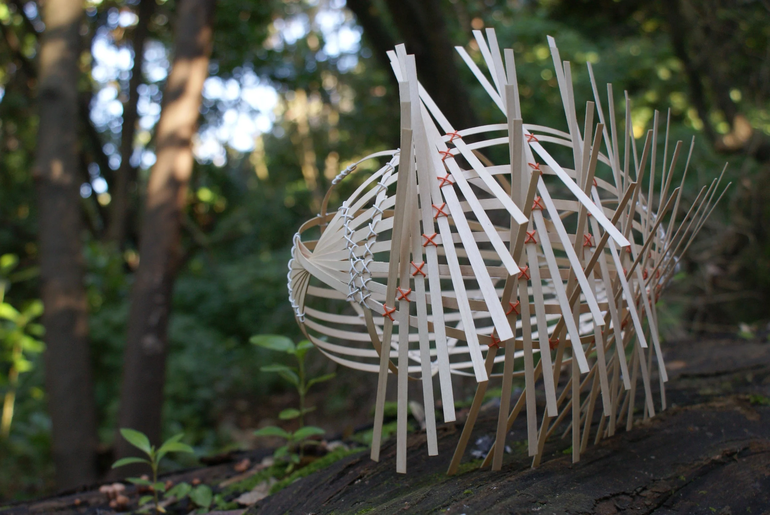
Weave explores the boundaries of traditional weaving when creating contemporary form.
Thin slices of birch veneer are thatched at each end then gently curved and twisted to form a "basket" with a spiralling pattern to one side. Shorter veneer is then weaved and thatched to one side of the "basket" to create the legs and emphasize the motion of weaving.
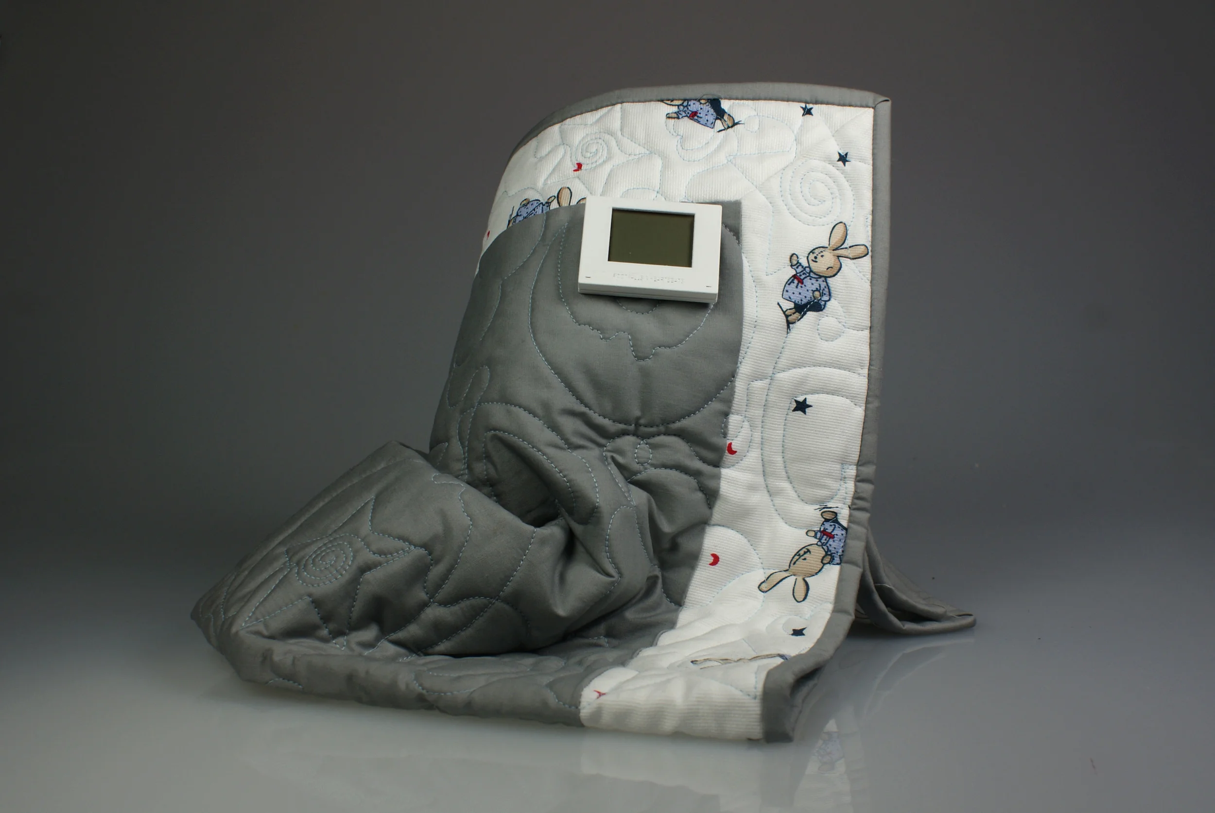
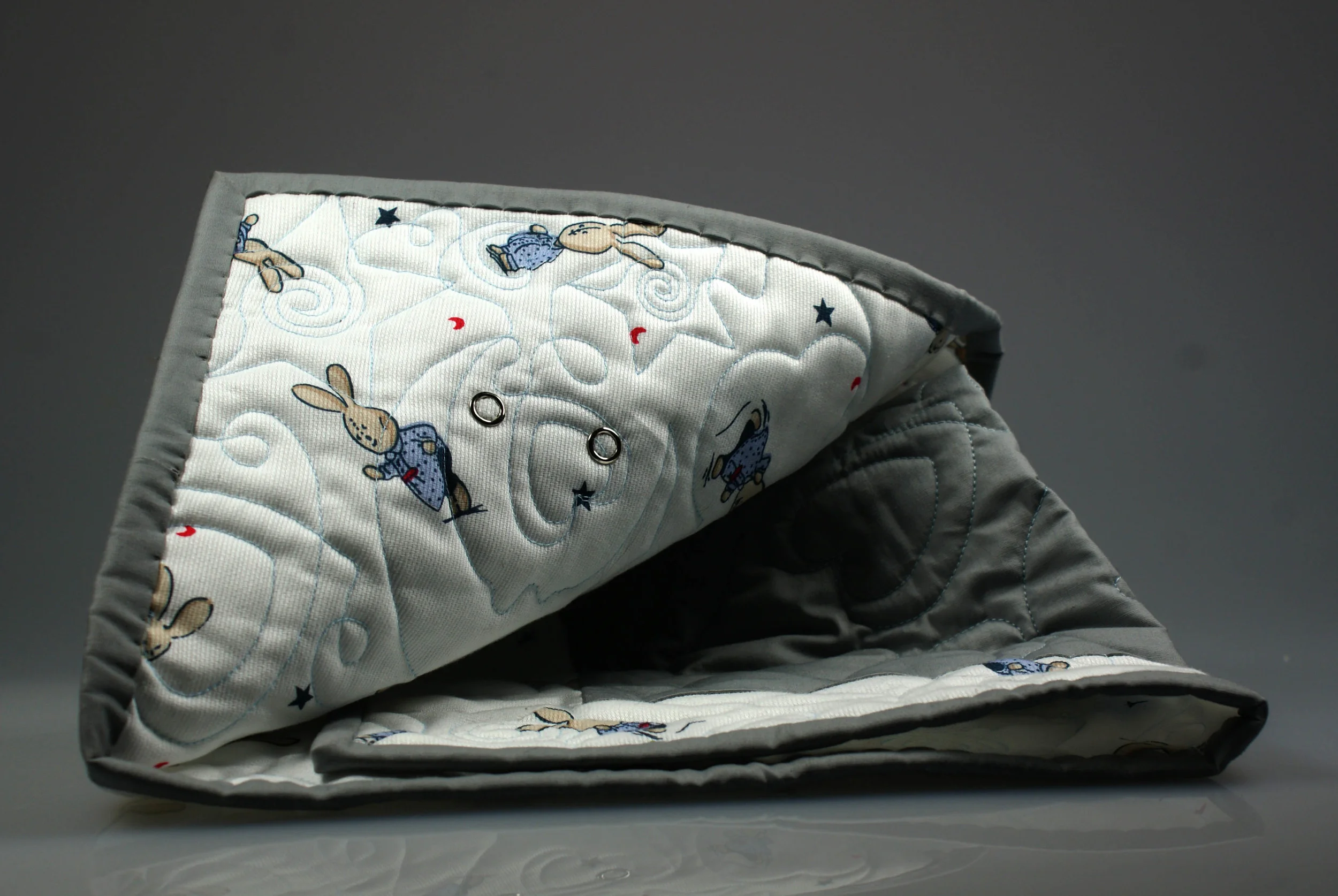
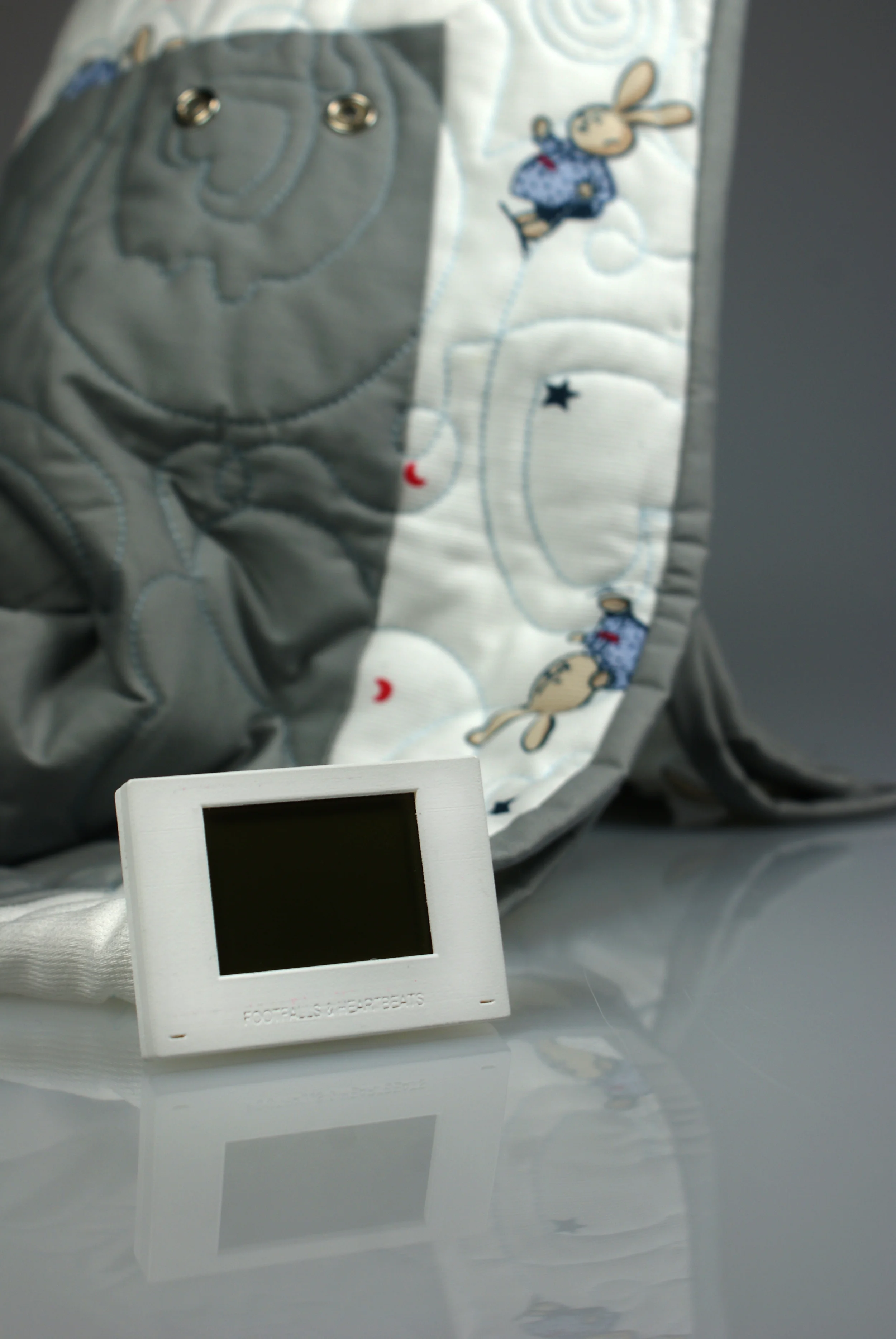
Footfalls & Heartbeats is an establishing New Zealand company that has produced a unique intelligent fabric that can detect an users heartbeat and respiration rate.
The 'Smart Quilt' is designed to be a comfortable base quilt for the infant to lay on whilst in an incubator. The use of the Footfalls & Heartbeats technology replaces the use of current wiring that is used to monitor vital signs, alleviating harsh visual wiring visible to parents. As the infant lays directly on the quilt the material receives the data, the data is then interpreted by the detachable monitor. This method of monitoring is completely noninvasive to to infant.
The 'Smart Quilt' package would include the Machine Washable Quilt, and a detachable monitor which can display the data or relay the data wirelessly to larger freestanding monitors currently used.
I curated the Tectonic Shifts exhibition which looked at the future of Christchurch post earthquakes. The exhibit considered multiple new identities that the city could take on as it recovered from the disaster.
The exhibition looked towards the future of a new Christchurch and the development of the city into the future. The spacial arrangement of the exhibition and the use of undulating plinths reinforces the theme, whilst being mindful of the heavy circulation of people using the space.
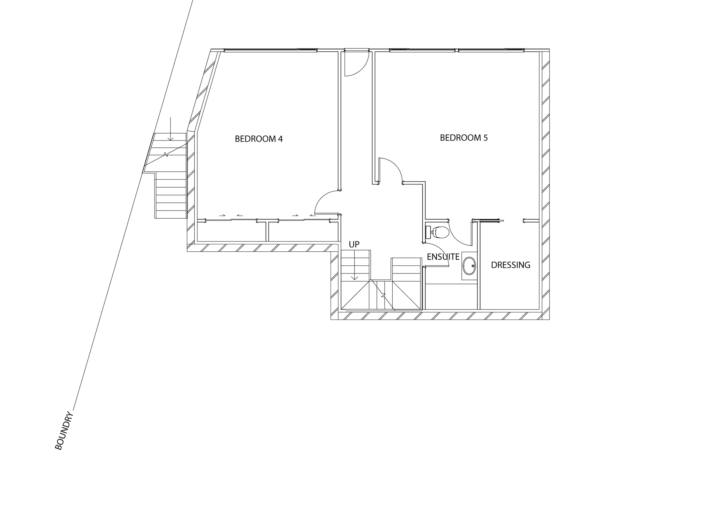
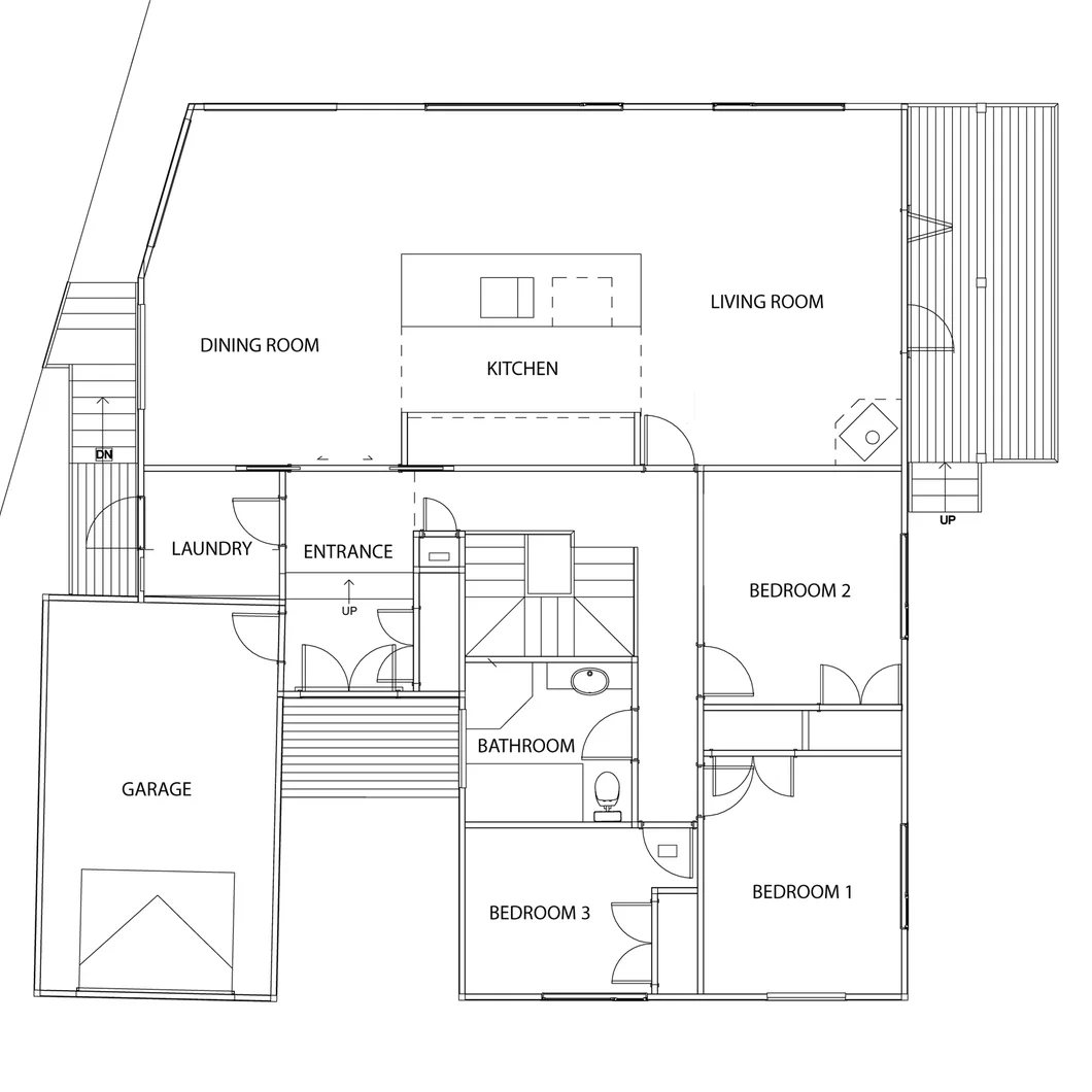
Working closely with my client, I crafted a series of concepts that took advantage of the various challenges the site presented and produced the final design.
As well as creating the working plans I liaised with an engineer for structural details, managed the consent process, performed site visits and coordinated with contractors.
I assisted my client with choosing fixtures and fittings to create a cohesive design throughout the old and new sections of the house.